Today we have a guest writer who recently gave a presentation on the topic of color and design. During her presentation, she covered a wide range of topics related to customization and personalization in the field of furniture and interior design. Please welcome Lauren Battistini from LFB Color Consulting!
LFB Color Consulting specializes in specifying colors, materials, and finishes for both residential and commercial spaces. This means that they provide expert advice on how to select the perfect color palette and materials to create a cohesive and aesthetically pleasing space.
In this blog post, Lauren will provide a brief recap of her presentation, highlighting the key takeaways on the importance of customization and personalization in the world of furniture and interior design. So sit back, relax, and enjoy the read!
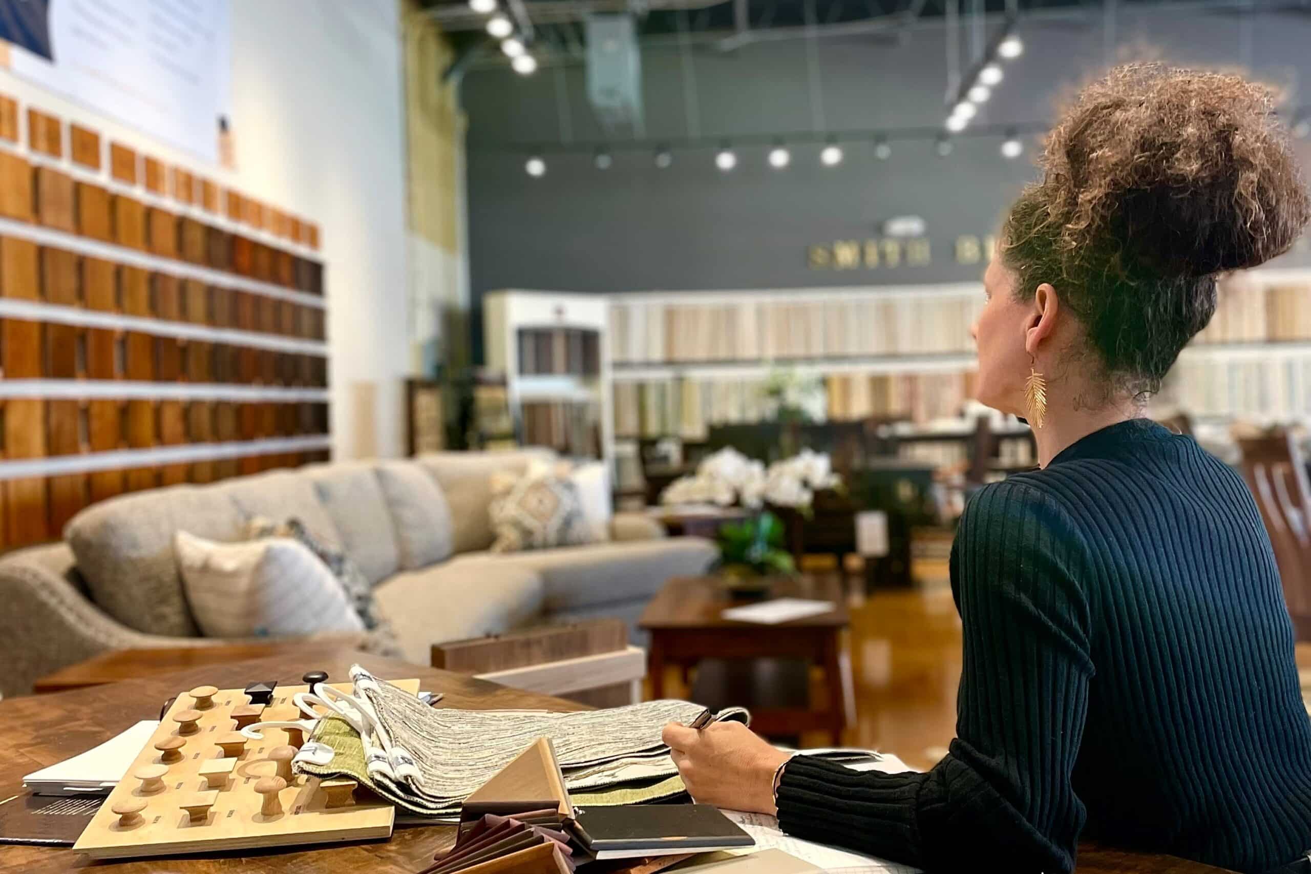
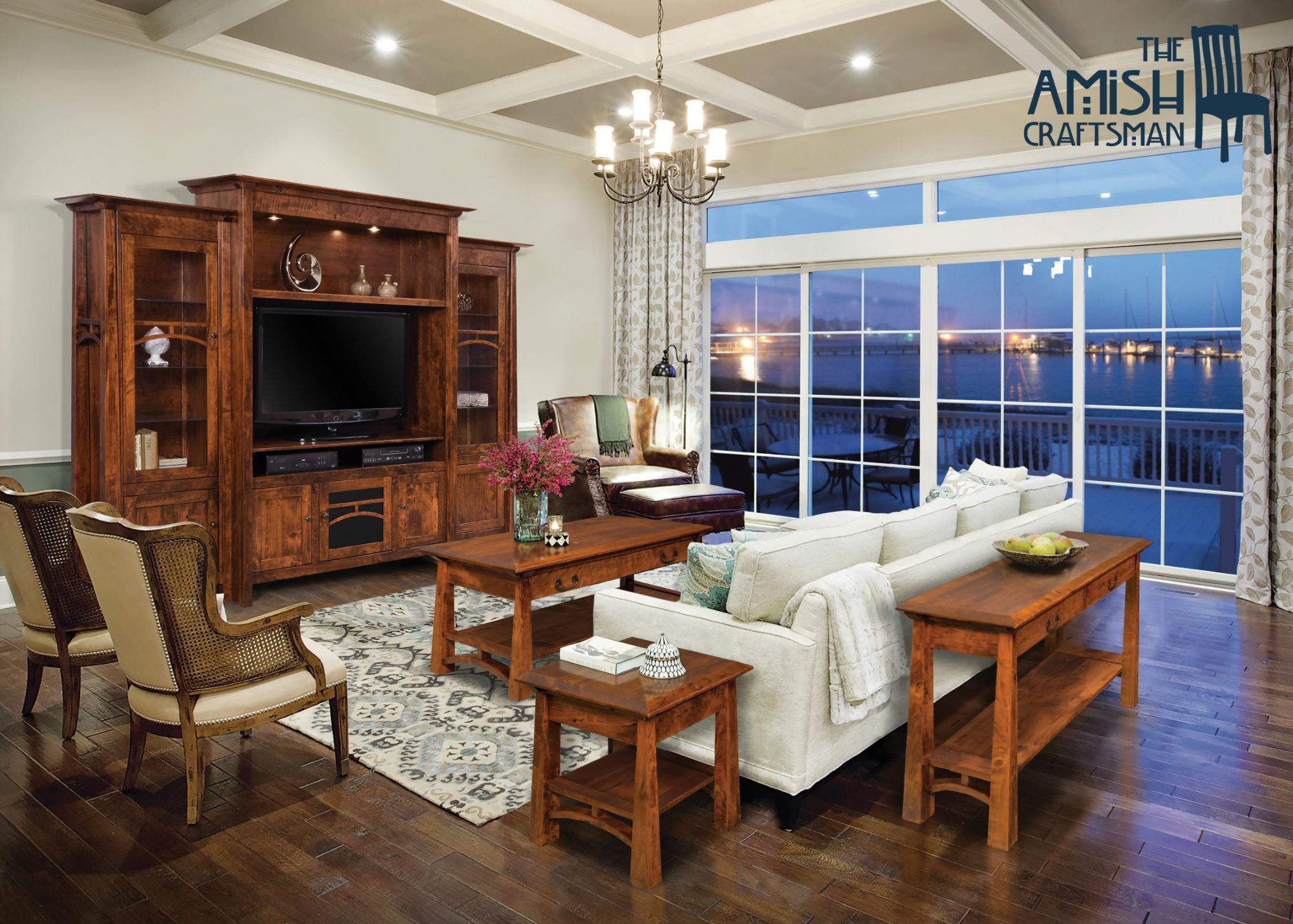
The Amish Craftsman and LFB Color Consulting both offer full customization and personalization in everything that we do. The Amish Craftsman offers dozens upon dozens of wood stain options, along with more customization in design, mixing of elements, hardware, and upholstery fabric options for any given furniture set.
TOPIC 1: Customizing with wood stains | fabrics
- Wood stains can be mixed and matched: cool and warm tones, light and dark woods.
- Rule of thumb when mixing and matching: semi-transparent stains pair well with other semi-transparent stains as opposed to pairing them with very opaque stains.
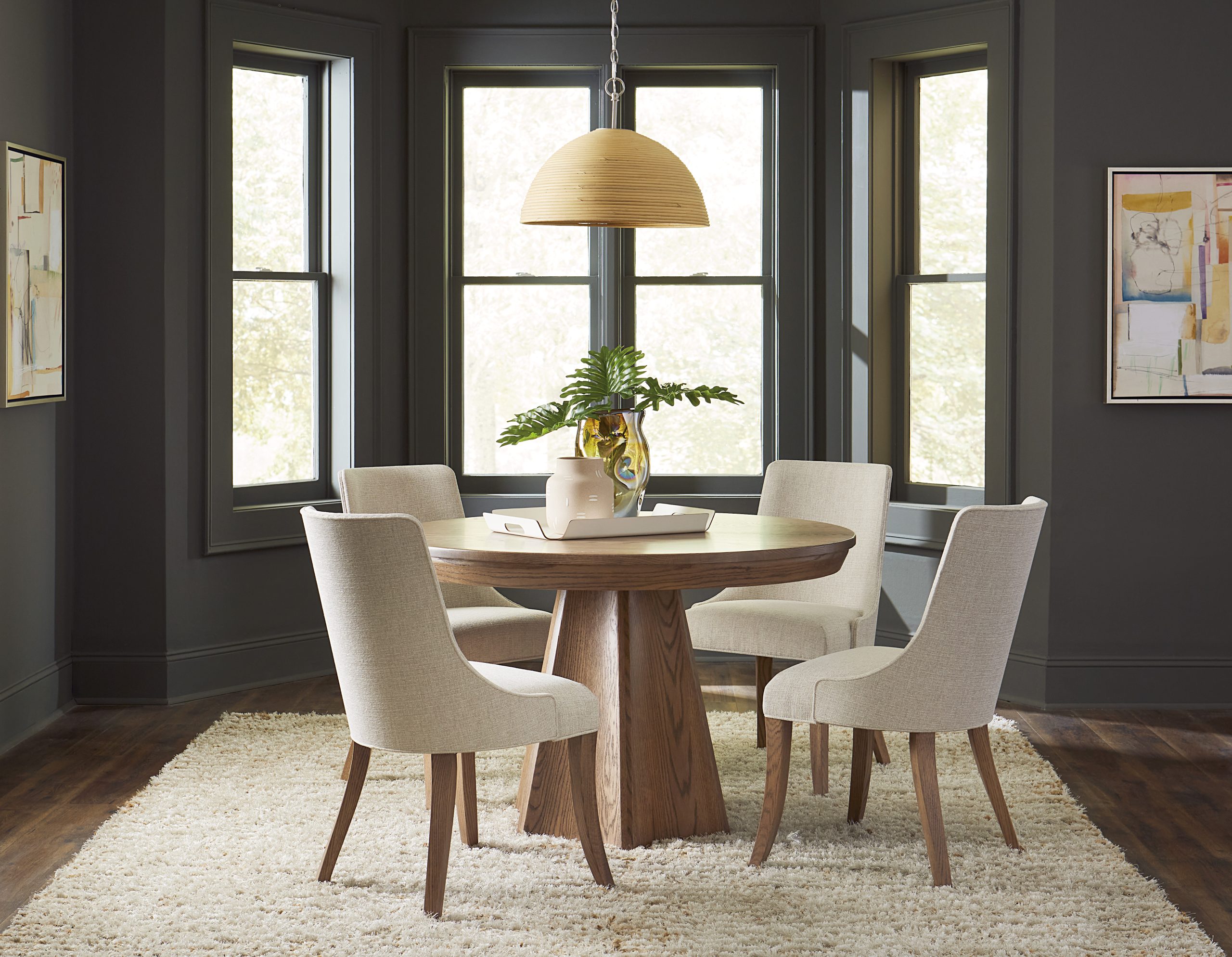
- Consider a dark table/chair top and light base and chair legs.
- Consider a light table/chair top and dark base and chair legs.
- Any warm wood stain will do wonders to balance the gray trend in flooring, countertops and other surfaces that homeowners invested in last season.
- Select lighter wood stained furniture to balance dark wood floors, and vice versa.
Balance is key between light and dark tones. Most homeowners prefer contrast. - If you prefer light color palettes, then it is perfectly fine to choose light wood flooring and light wood furniture. This is a good place to mix warm and cooler (a slight gray cast to the wood stain) stains, both of them light. Bring in small elements of brown, gray or black in art frames or table tops to provide a slight measure of contrast.
- For upholstery fabric selection, consider two solid-colored fabrics and one print that incorporates both colors.
- Another option is to choose one solid color, one neutral, and one print that incorporates the color.
TOPIC 2: 2023 Design Trends
- The quickest way to modernize a piece of wooden furniture is through added touches of black. This can take the form of black hardware, table top or table base, chair legs, area rugs with touches of black, lamps with dark oil rubbed bronze (looks black), and abstract print fabrics incorporating black.
- Mixing and matching metallic hardware in plumbing and lighting fixtures, as well as furniture, is a huge trend. Mix and match any metallic as long as you keep the finish consistent. Brushed, antiqued finishes pair well together, and high chrome finishes pair best with other high chrome finishes.
- The overarching design theme moving forward is customizing and making a space your own. This can be achieved through mixing and matching different wooden chair styles at the same table, mixing modern and antique pieces, choosing area rugs that combine but don’t match the surrounding colors and decor perfectly, and choosing handmade over mass-produced furnishings.
TOPIC 3: Color mixing and matching
- Green sofa styled three ways:
- Green sofa with yellow throw pillows and upholstered chair
- Green sofa with a different floral pattern for throw pillows (incorporating various shades of green) and a rug that pulls in black and green
- Green sofa is the focal color point with two different neutral fabrics mixed (one for throw pillows and the other for an upholstered chair opposite the sofa).
See image below:

- We introduced a 10-color palette inspired by The Amish Craftsman and utilizing Benjamin Moore paint colors. These colors all mix and match seamlessly because they are of the same level of CHROMA.

- We defined CHROMA as the purity, saturation, or boldness of a color. High chroma colors can be light, medium or dark but are always intense and vibrant (cobalt blue). Low chroma colors have been muted, grayed down, subdued and are much softer (baby blue).
- The only color “rule” I believe you should follow is to keep chroma consistent when building your color palette.
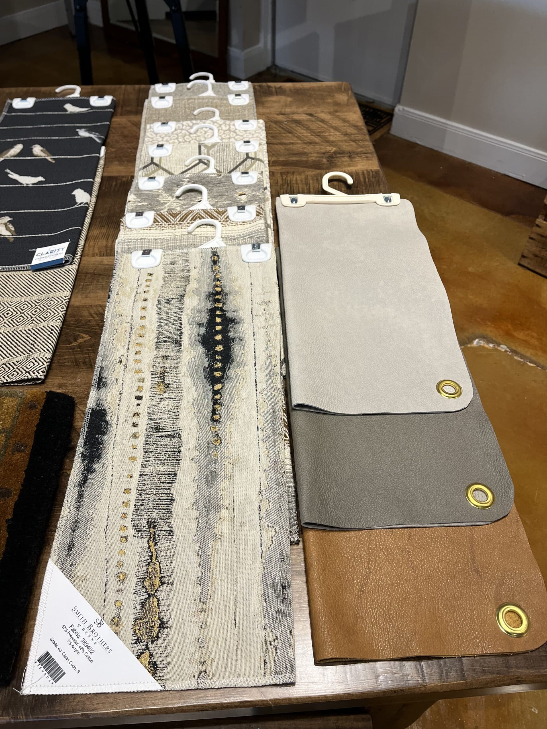
- I also introduced a neutral fabric collection using Smith Brothers of Berne brand upholstery fabrics in the showroom. Each fabric mixes warm and cool neutrals and
is perfect for homeowners looking to break away from the gray trend and add warmth. I also introduced one warm brown and two gray solid leather fabrics to complement the collection.
See image below:
I would like to take this opportunity to thank everyone who attended my presentation on color and design. I hope you found the information useful and insightful. If you have any further questions or would like to learn more about the services offered by LFB Color Consulting, please do not hesitate to contact me.
At LFB Color Consulting, we pride ourselves on providing exceptional service and expertise in the field of color and design. Whether you’re looking to refresh your home or office space, we can help you select the perfect colors, materials, and finishes to create a beautiful and functional space that reflects your personal style.
Colorfully yours,
Lauren Battistini | Chief Color Strategist of LFB COLOR CONSULTING
281-989-4086

